Brand strategy · Identity · Packaging
Crunch Cola
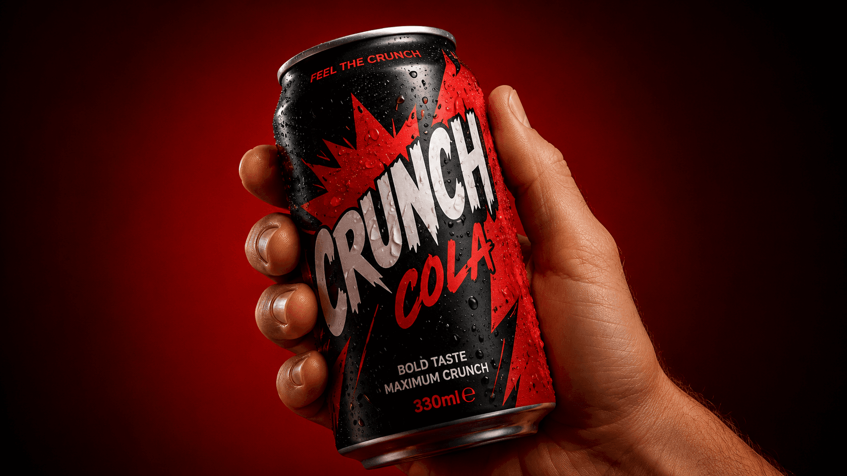
A new identity and packaging system built to turn a young beverage brand into a shelf-level interruption.
Client
Crunch Beverages
Year
2025
Discipline
Identity, Packaging, Campaign
Overview
The brief, and the bonk
The challenge
Crunch was a tiny challenger fighting two giants for shelf space. The old branding was beige, polite and invisible exactly the wrong energy for a drink that wanted to feel electric.
Our approach
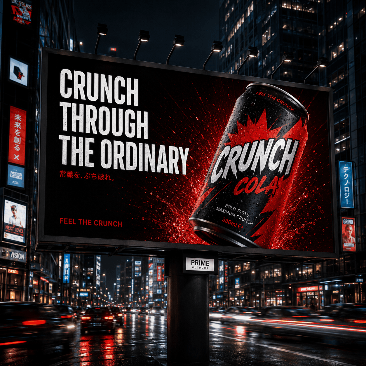
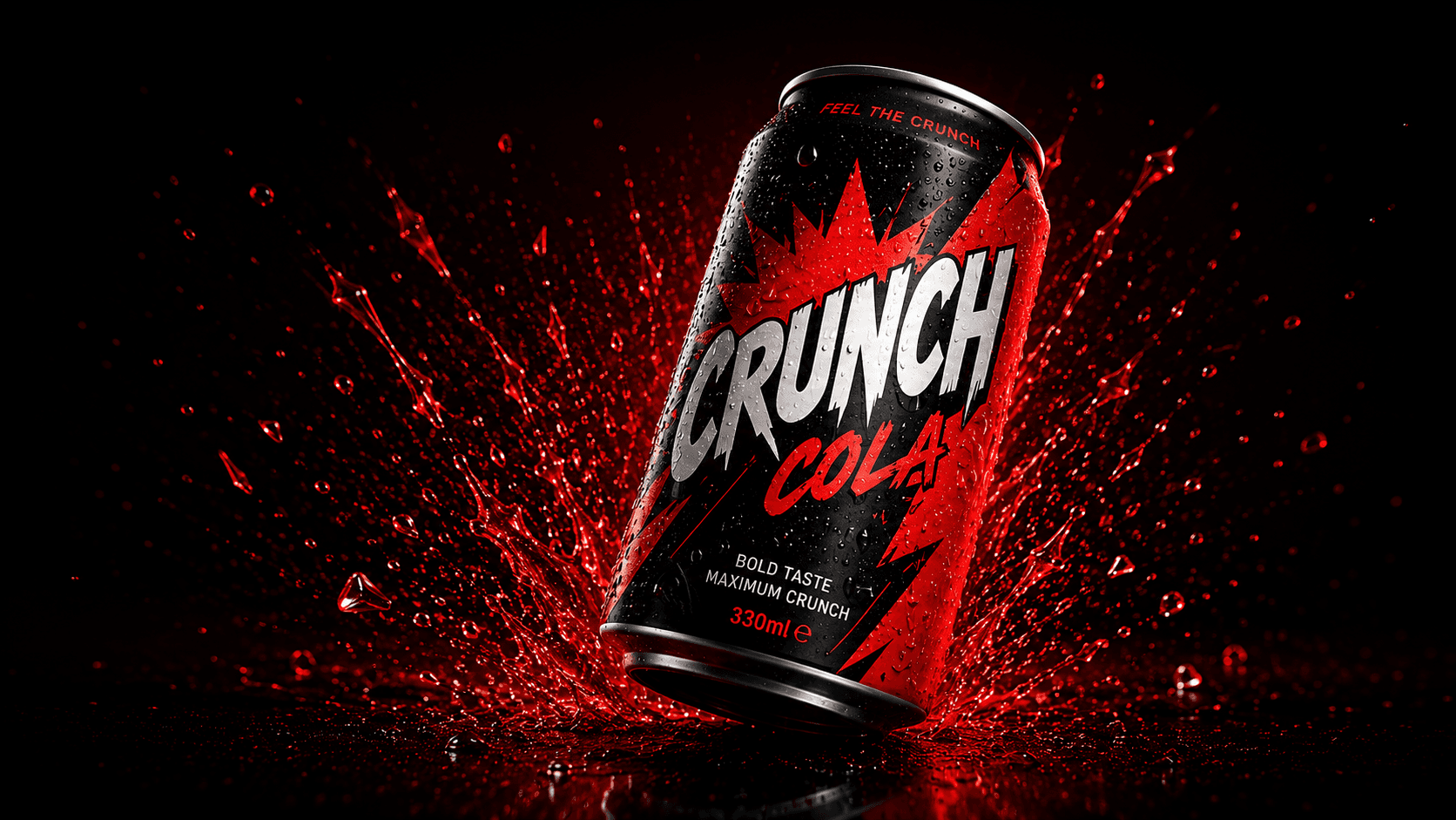
We built the whole identity around a single ownable idea: crunch. A jagged, kinetic wordmark, a high-voltage palette and packaging that physically pops on shelf, rolled across cans, OOH and a launch film.
The outcome
The relaunch doubled trial in its first quarter and turned a no-name soda into a brand people actually screenshot.
+0%
Trial rate
0 wks
To shelf
0.0M
Launch views